How to Read Bitcoin Price Charts
Learn how to read and analyse candlestick patterns, which can help you to identify when a trend in the price of bitcoin may continue (or reverse).
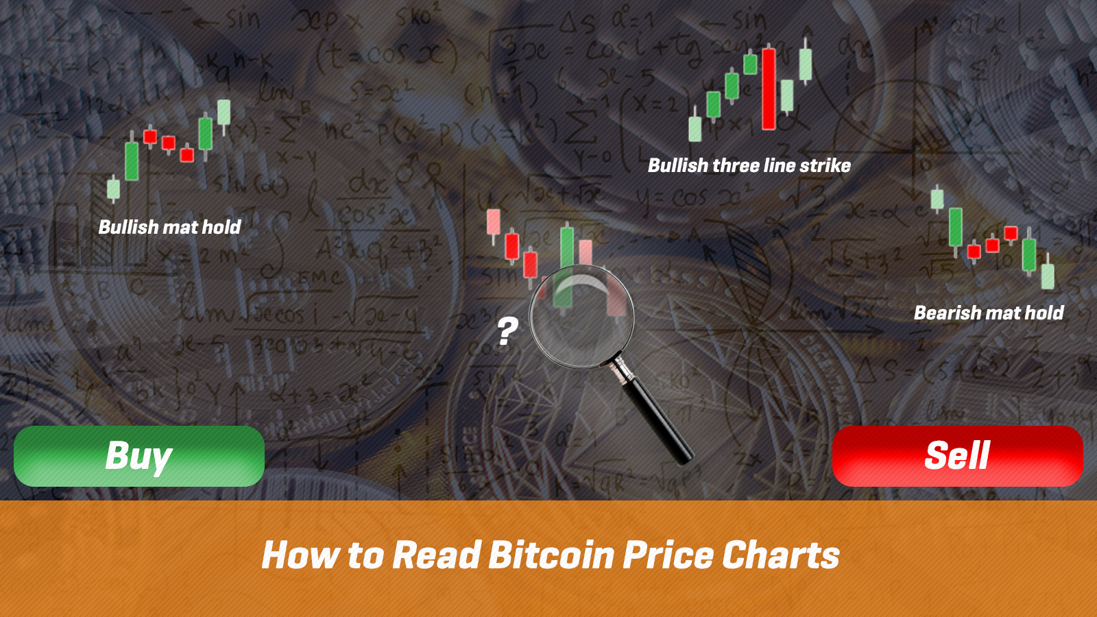
Bitcoin price charts look daunting at first sight. In this guide, we will break down how to read bitcoin price charts so it’s easy to understand.
In this article, we’ll break down the basics of price charts so you can analyse them to trade cryptocurrencies on Rollbit.
The line chart is the simplest type of chart. These basic charts show how the price of an asset (like bitcoin or ethereum) has moved over time and where it is currently at:
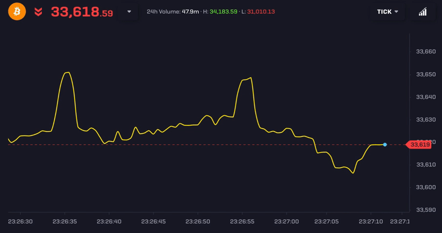
While it’s simple, it’s not that useful as a lot of information about the past behaviour of the price is missing from these charts. Technical analysis is the study of past price behaviour to find high probability trading setups, including where to enter and where to exit.
Most traders start with candlestick charts as an introduction to technical analysis. Candlestick charts go back hundreds of years and originated in Japan amongst rice traders. These charts convey more information than a simple line chart, improving your ability to recognise profitable opportunities in the market.
Let’s take a closer look at candlestick charts to discover the advantages over other types of charts.
What are Candlestick Charts?
As mentioned already, the major advantage of a candlestick chart over a simple line chart is that more information about the price of an asset is displayed. The more information we have, the more we can understand the seemingly random market movements.
For example, a candlestick chart shows several prices, not just the closing price or current price like a line chart. The candlestick chart shows the current price, the opening price (Open), the highest price (High), the lowest price (Low) and the closing price (Close) for each time period. Until the candle closes, the current price is treated as the closing price on the chart.
Because we can quickly assess the information from a candlestick chart, investors and traders worldwide use them to decide when to buy or sell a wide range of assets, including commodities, cryptocurrencies and stocks.
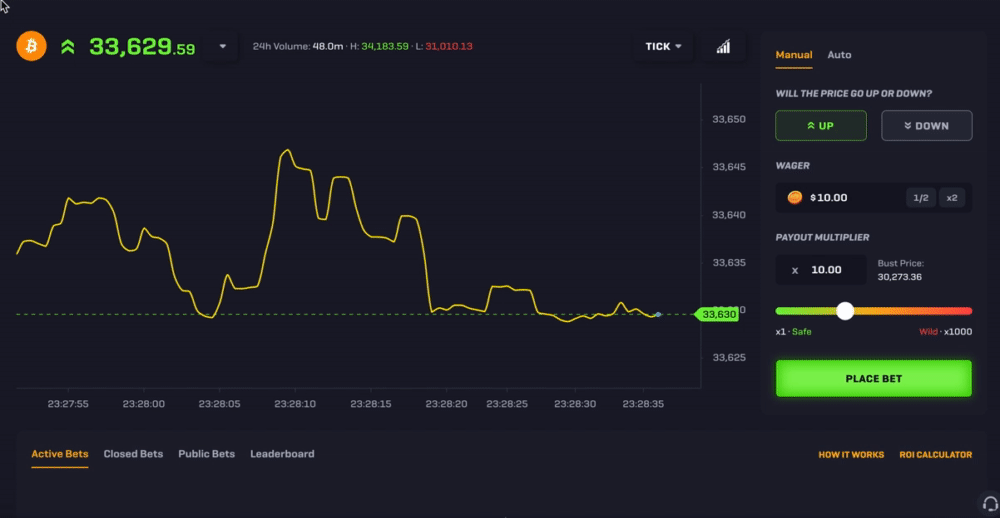
Trade BTC, ETH, DOGE and LTC on Rollbit here!The default timeframe for charts on Rollbit is the ‘tick’ level (showing each market movement). To switch to a candlestick chart view, click on the button that says ‘Tick’ on the top right-hand side. You can then select your desired timeframe (from 5 seconds up to 1 day):
The main feature of candlestick charts are candles, representing the price action during a particular time period.
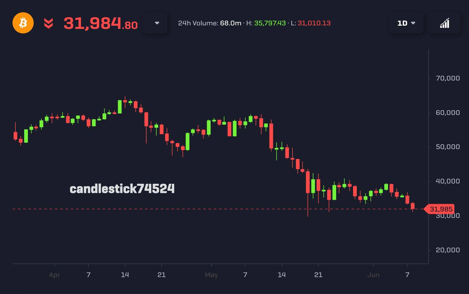
For instance, the screenshot below shows a 1-day chart for BTC-USD with the price of bitcoin plotted on the vertical axis and time plotted on the horizontal axis. Each candle represents the price action over one day. The colour shows whether the closing price was higher than the opening price (green) or if the closing price was lower than the opening price (red):
So on a day where the price of bitcoin increased, the candle will be green. For a day where the price of bitcoin fell, the candle will be red.
It's also worth mentioning that candles have two components: bodies and wicks.
The body of a candlestick is the thick part which shows the distance between the opening price and closing price. Until a candle has closed, the body will be the difference between the opening price and the current price, continuing to change until that time period is over.
The thin lines that appear at the top and bottom of some candles are called wicks, where the upper wick shows the highest price for that day and the lower wick displays the lowest price for that day. It's important to pay attention to wicks as they show price zones where buyers or sellers tried to move the market in their favour, but they failed to sustain this movement. As a result, wicks are often viewed as critical areas of support or resistance.
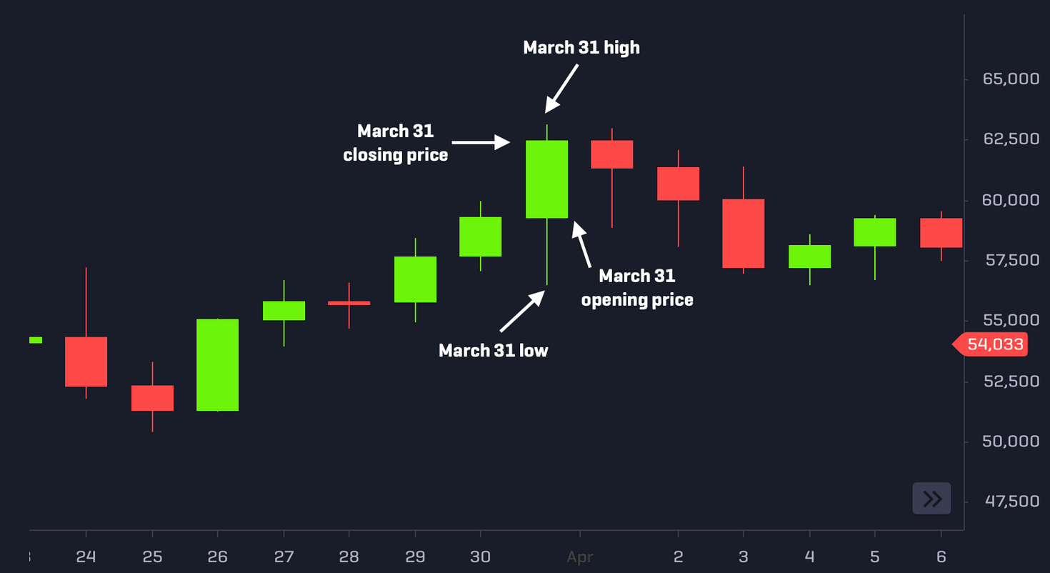
The anatomy of a candlestick using the price action of bitcoin on March 31, 2021.
Each candle closes once the trading session is over, whether that be one minute, hour, or day. The candlestick becomes fully formed, with the closing price at the end of each trading session. In the next trading session, a new candle will open and will close at the end of that timeframe.
Analysing Bitcoin Charts with Candlestick Patterns
By examining a candlestick chart, we get an accurate summary of the previous price behaviour. Typically, it's not as risky to go in the same direction of the trend and it's often given as advice to newbie traders that 'the trend is your friend'.
It’s also important to look at the previous candles (the further back you go, the better!) to assess what’s been happening in the market that led up to the present and to help you make a more informed decision of how the price action might develop.
For example, if you look at the past 100 candles and notice that one colour dominates the chart, it signals a trending market. If there are mostly green candles, then it shows buyer strength, and the trend is bullish. Here, we should analyse the chart to look for signs of trend continuation.
If there are mostly red candles, then it shows weakness, and the trend is bearish. Again, you’d want to look at the chart to find setups for a continuation in the downward price action.
Trend Continuation Patterns
In this section, we'll look at three trend continuation patterns: the Marubozu, the Rising Three Method/Falling Three Method and the Bullish/Bearish Mat Hold.
Bullish/Bearish Marubozu
The Marubozu (meaning 'bald head' in Japanese) is a single candlestick pattern that shows a situation where buyers or sellers were in control of the entire trading session, that is, it has a large body with little to no wicks on either side.
A Bullish Marubozu has a large green body, meaning buyers pushed the price higher over the course of the trading session and the price closed near the highest price in that session, while a Bearish Marubozu has a red body, with the price closing at or near the lowest price for that session. Since at the close of a Marubozu candle, either the buyers or sellers are strongly in control of the market at that point, so it is a useful pattern to recognise trend continuation.
The larger the body of a Marubozu candlestick, the more weight we should give it as an entry signal. Remember, it is important to consider the context of the candlestick pattern (rather than in isolation) and the prior candlesticks before that.
Once you've spotted a Marubozu pattern, the opening price and the midpoint of the candle can be used as potential entry points into the underlying trend. The open price and midpoint of a Marubozu frequently offers a support level for Bullish variants (or resistance for Bearish variants).
With a Bullish Marubozu, since buyers took complete control during that session, a return to the open price or midpoint of this pattern is likely to see renewed buying interest. Similarly, a return to the open price or midpoint of a Bearish Marubozu is likely to see selling pressure reinvigorated.
Let's look at an example below, which shows a Bearish Marubozu on the 1-hour chart for bitcoin:
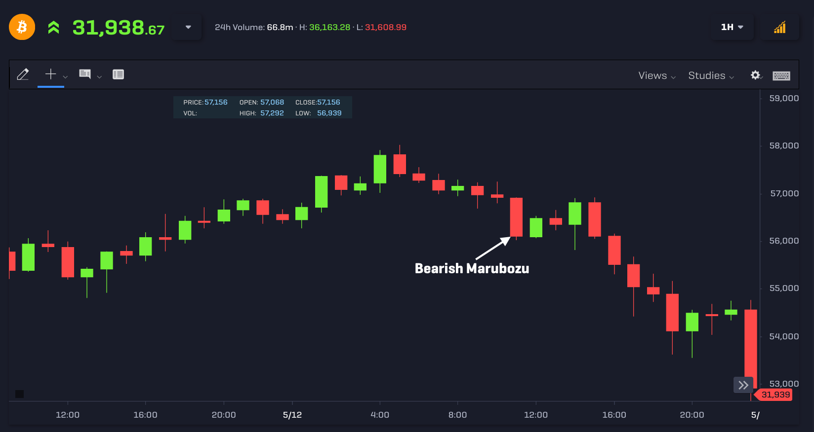
Once the Marubozu has formed, we can get in on the underlying trend by entering near the midpoint of the candle (at $56,498) or near the opening price of the Bearish Marubozu (at $56,906).
We see that after the Marubozu pattern was completed; the market tested both the midpoint of the candle's body (at $56,498) and the open of the Bearish Marubozu (at $56,906), which would've given you an opportunity to sell bitcoin and profit from the downward trend. The market attempted to move back above the high of the Bearish Marubozu but stalled and continued downwards, reaching lows beneath $53,000 around 10 hours later.
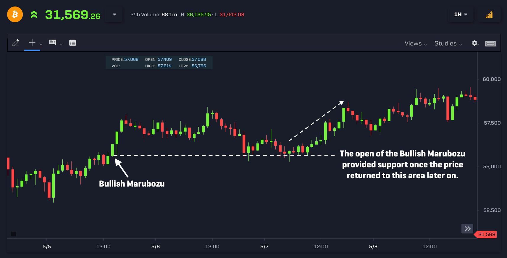
A Bullish Marubozu pattern provides an opportunity to buy a cryptocurrency to profit from an upward trend. As shown below, the market tested both the midpoint and the opening price of the Bullish Marubozu candle multiple times, before continuing higher:
Rising Three Method/Falling Three Method
The Rising Three Method is a five-candle pattern that usually suggests a continuation of an uptrend. For this pattern, the first candle is a long green candle followed by three red candles with bodies inside the range of the first candle. The last candle is green and closes above where the first candle closed.
An example of the Rising Three Method pattern is shown below using the 15-minute chart:
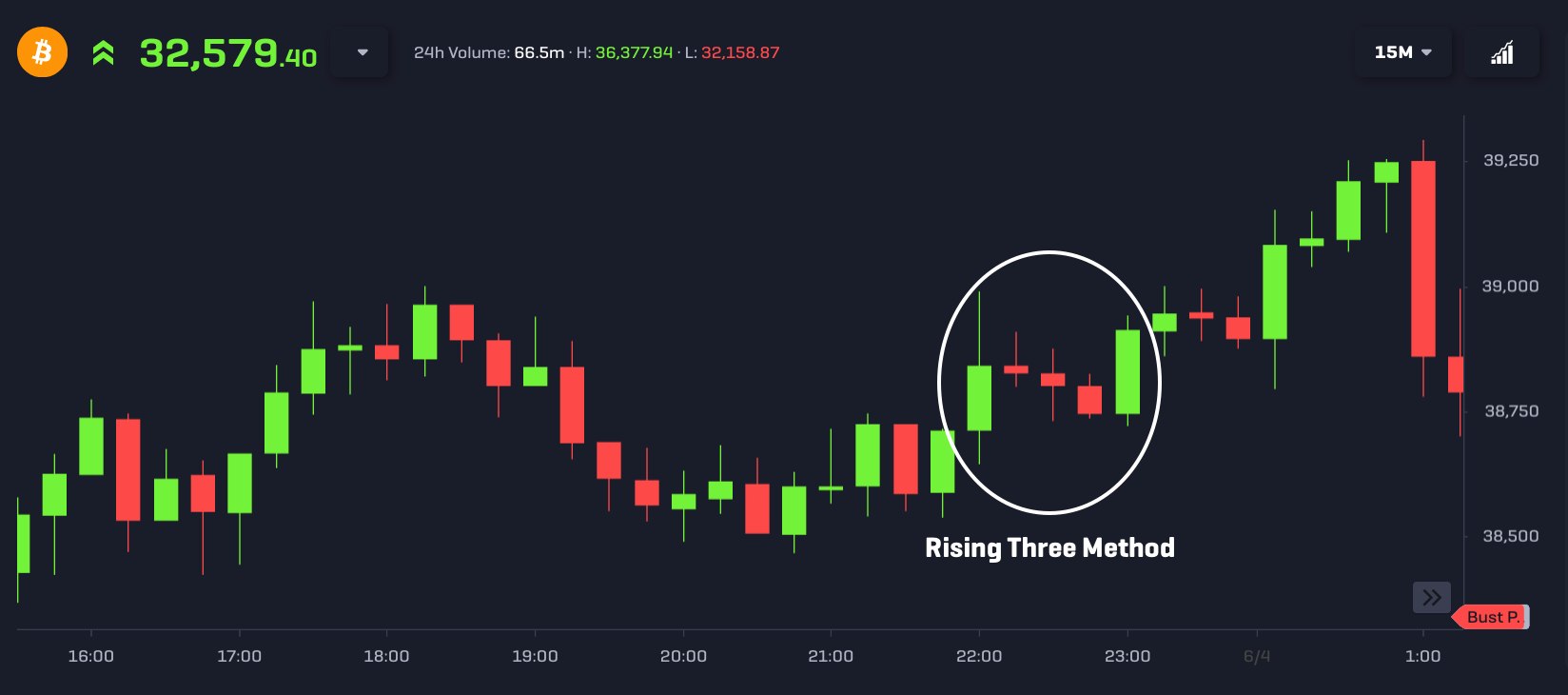
Notice that after the Rising Three Method pattern, the price increased from just below $39,000 and continued to climb higher, reaching a peak near $39,250.
The Falling Three Method is the reverse of the Rising Three Method. The first candle is red and long, followed by three green candles which are contained within the range of the first candle. Finally, the last candle is red and long, closing below where the first candle closed.
An example of the Falling Three Method is shown below using the 1-hour chart for bitcoin:
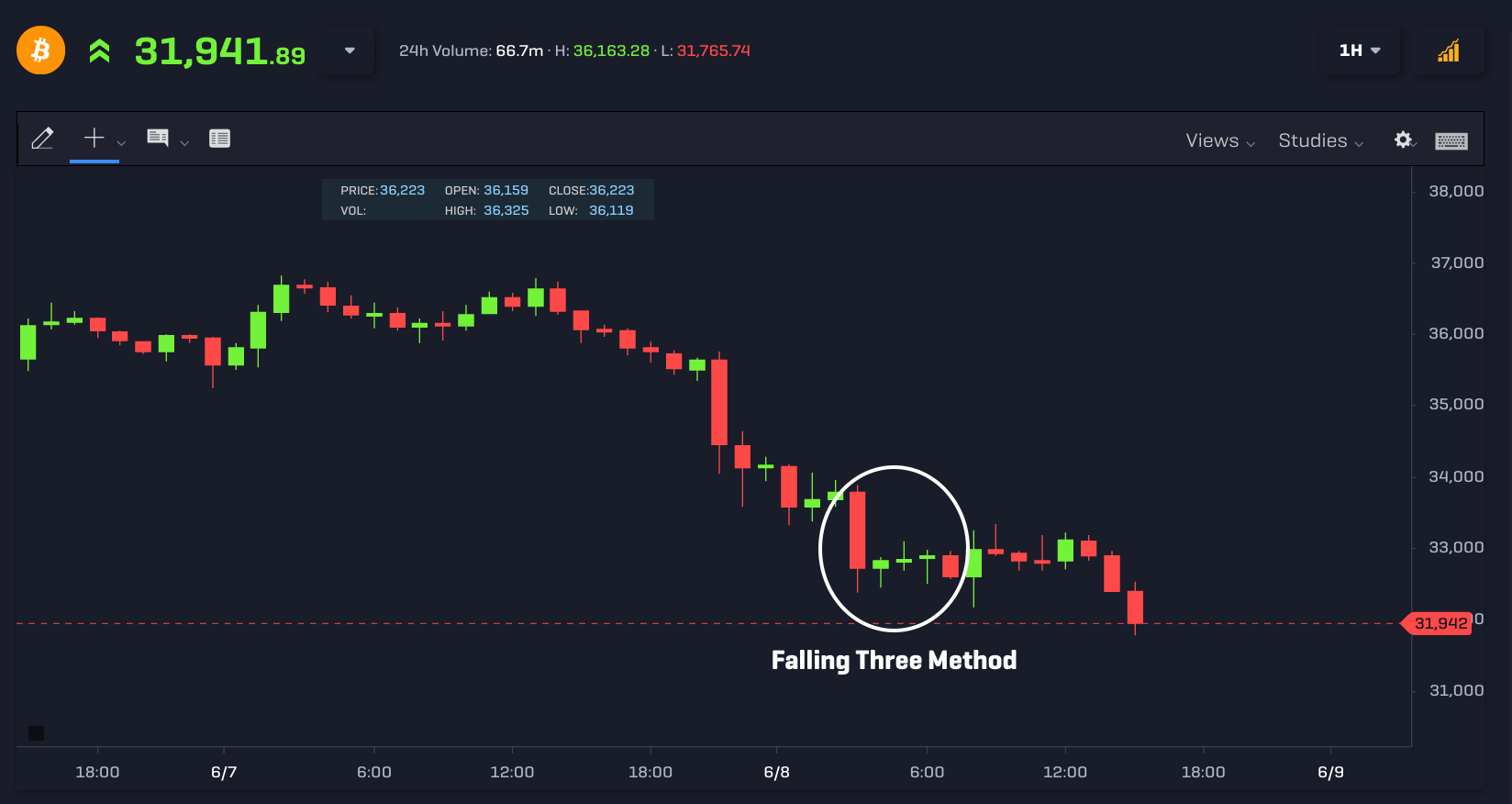
Notice that prior to the Falling Three Method, the price of bitcoin was in a short-term downtrend. Once the pattern was formed with a closing price of $32,597 on the fifth candle, the price eventually continued going lower and reached lows near $31,700.
Bearish/Bullish Mat Hold
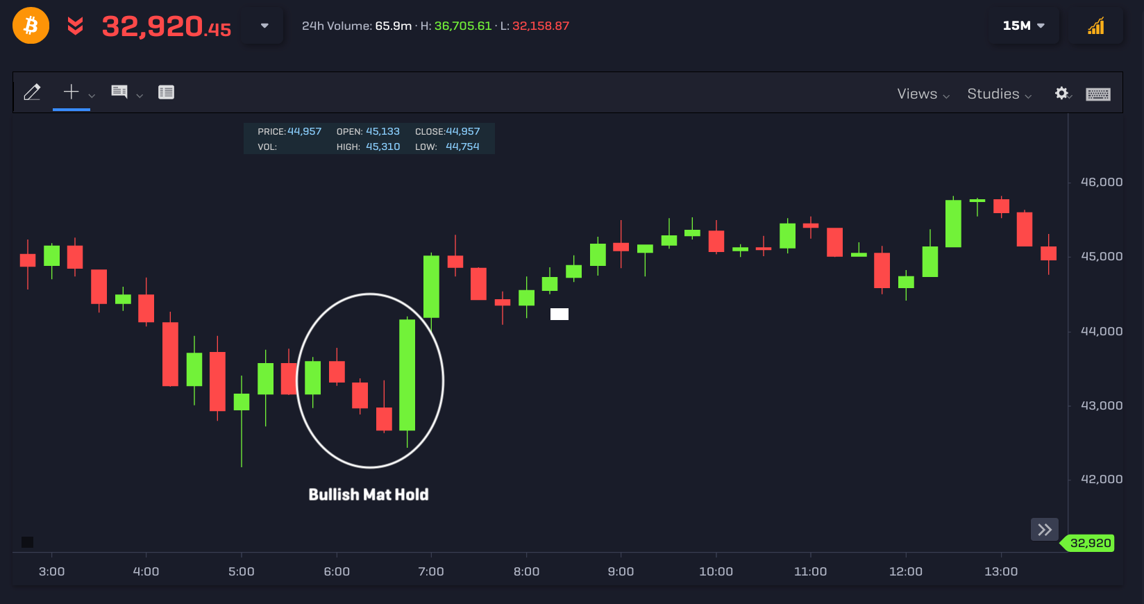
The image below displays the Bullish Mat Hold pattern, which looks similar to the Rising Three Method formation. However, the difference between the Rising Three/Falling Three Method and the Mat Hold patterns is that the three middle candles do not need to be confined within the range of the first candle.
In the pattern highlighted below, the three middle candles go well below the lowest price of the first bullish candle, so it's not considered a Three Rising Method pattern - but instead a Bullish Mat Hold. However, like the Three Rising Method, the last green candle closes above the highest price of the first bullish candle:
A Bearish Mat Hold is like a Three Falling Method, except that the three bullish candles in the middle go above the high of the first bearish candle.
While going along with the trend is the relatively safer option for traders, there are also trend reversal patterns to look out for. Going against the trend might be more rewarding if you can get in at the right time around the end of an existing trend.
In the next section, we'll look at candlestick patterns that can help you identify trend reversals.
Trend Reversal Patterns
In this section, we'll look at the following trend reversal patterns: the Hammer, the Shooting Star, the Gravestone Doji, and the Engulfing pattern.
Hammer
The Hammer candlestick is a common pattern found at the end of a downward trend and suggests a change in trend could be underway. This pattern shows sellers tried to push the price lower but this selling pressure was absorbed by buyers, who managed to push the price higher to close above the opening price.
Some typical rules to find a Hammer candlestick pattern: the wick of the Hammer must be at least three times longer than the body of the candlestick. We'd also like to see rising volume during the same trading session as the Hammer candlestick (or in the following trading sessions) for further confirmation.
An example of how to trade the Hammer candlestick is shown below by the 5-minute chart:
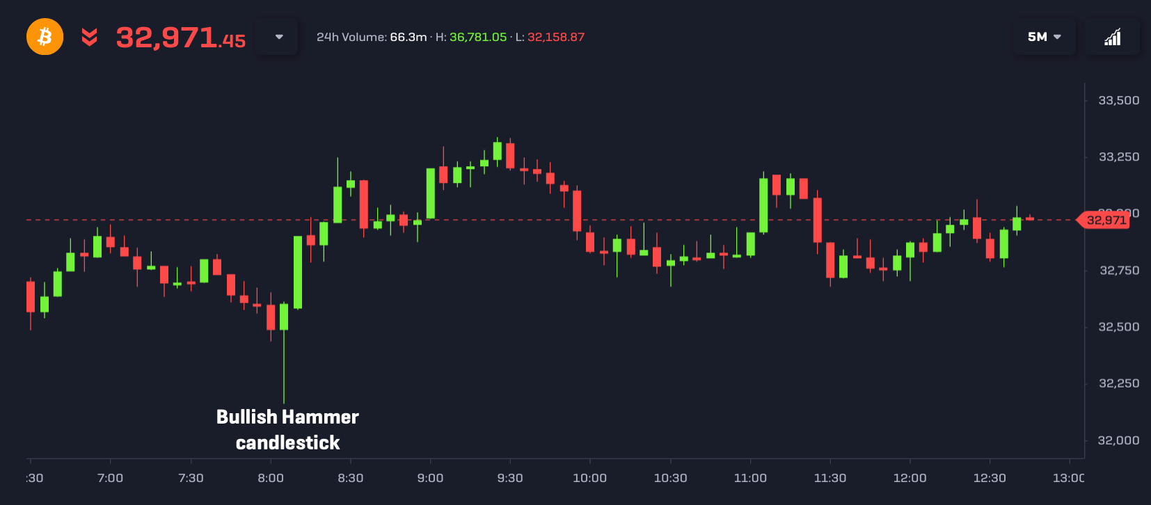
After a downward move, a textbook Hammer pattern formed on the close of this 5-minute candle, so we'd look to buy BTC near the closing price of $32,600.
In the trading sessions that followed, the price continued higher and reached a peak near $33,250. You could also wait for further confirmation after a Hammer candlestick pattern before you buy (for example, strong buying volume).
Shooting Star
The reverse of the Hammer candlestick pattern is known as the Shooting Star pattern.
The Shooting Star candlestick is generally found near the end of an upward trend and signals that a reversal could be underway. This pattern shows buyers tried to push the price higher, but this pressure was absorbed by sellers, who pushed the price to close below the opening price.
As with the Hammer candlestick pattern, they are some rules of thumb to determine whether a candlestick is a Shooting Star: the wick of the Shooting Star candle must be at least three times longer than the body. For further confirmation, we’d also like to see rising volume once we observe a Shooting Star candlestick (or in the following trading sessions).
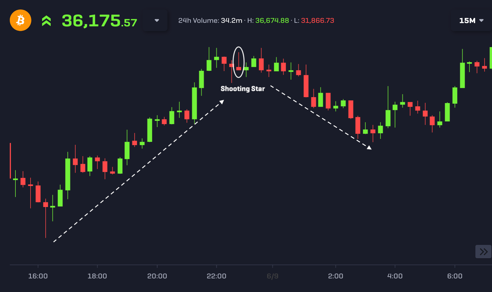
An example of the Shooting Star pattern is displayed below by the 15-minute chart for bitcoin. Once the Shooting Star candlestick was formed at a price of $33,462, the price declined to lows near $32,400:
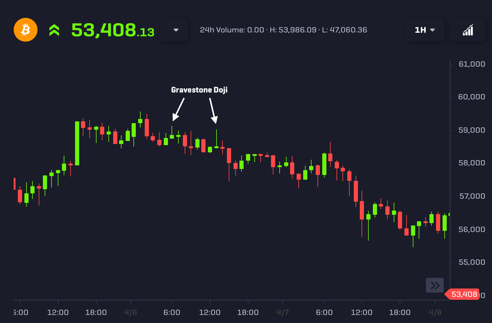
Gravestone Doji
If the Gravestone Doji pattern is found during an uptrend, then it could suggest that a reversal is unfolding, as this formation shows that buyers tried to push the price higher, but failed with the price settling much closer to the trading session's lowest price:
Along with the Gravestone variant, other types of Dojis include: the long-legged Doji (a Doji with a long lower wick which illustrates buyer strength), the Dragonfly Doji (which predicts a price increase if found in a downtrend) and the standard Doji (which is neutral and requires careful analysis of the preceding candles to assess whether it's bullish or bearish).
Bearish/Bullish Engulfing
One of the most frequent candlestick patterns found when looking at bitcoin charts is the Engulfing pattern, and is an important formation since it tells us that sellers have overtaken the buyers (or vice versa).
- The Bearish Engulfing pattern usually occurs during an uptrend and signals that a downward trend may be beginning. This pattern comprises two candlesticks: the first is bullish (green) then a bearish candle (red) that engulfs the previous one follows.
- The Bullish Engulfing pattern usually occurs during a downtrend and signals that an upward trend may be beginning. Again, this pattern also comprises two candlesticks, but the first is bearish (red) then a bullish candle (green) that engulfs the previous one follows.
Both of the Engulfing variants are displayed on the 4-hour chart of bitcoin below:
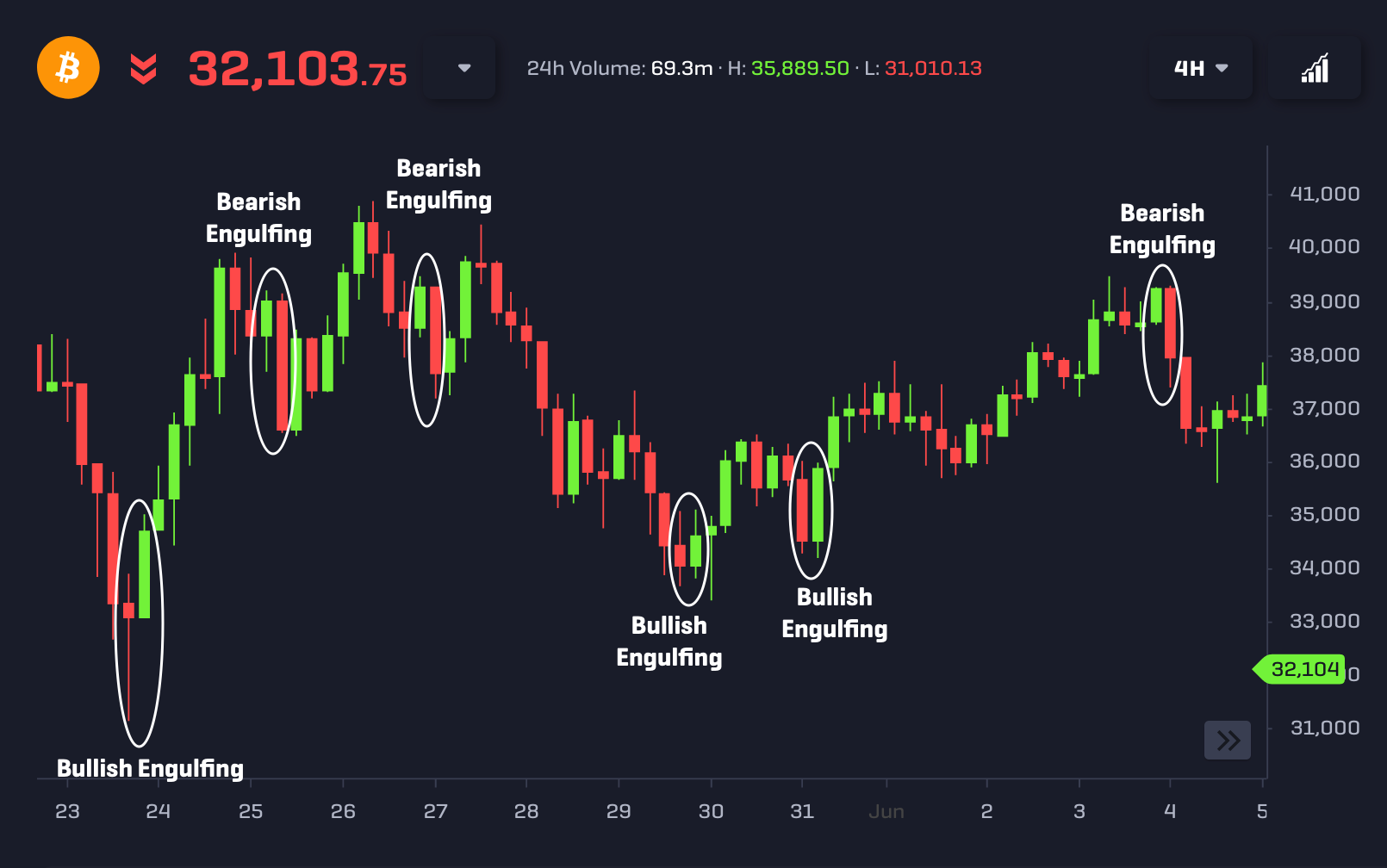
There are many more instances of Engulfing patterns in the chart above (see if you can find them all!) but they're less significant and hold less weight.
The image above only highlighted the more significant patterns that are likely to have a higher probability of success, since they have a much greater engulfing effect (meaning the second candle moves out further above the high or below the low of the first candle). A greater engulfing effect provides a stronger signal since buyers/sellers moved the price further away from the previous high/low.
More Tips on Candlestick Analysis
- Candlesticks are the basis for most technical analysts and acting on these patterns can be part of a profitable trading strategy. Many profitable traders utilise candlesticks with other forms of analyses for their strategies.
- Candlestick patterns may increase the probability of the price continuing or reversing, but they are not definitive indicators of what the price may do. You should look at candlesticks from a probabilistic perspective and interpret the pattern within the context of the past price action.
- Using higher timeframes when trading cryptocurrency tend to provide more reliable signals for candlestick patterns (think 1-day or 4-hour charts) as compared to lower timeframes (e.g., 5 minutes, 15 minutes, etc.).
- In his book Encyclopedia of Candlestick Charts, Thomas Bulkowski created performance rankings for candlestick patterns, finding that the Three Black Crows and Evening Star patterns predict price decreases with high accuracy (78% and 72% respectively). One of the best patterns for predicting price increases was the Three Line Strike, with an accuracy rate of 83%. However, it's worth noting that Bulkowski's book was published in 2008, before Bitcoin was invented. So it might be worth exploring which patterns work best for BTC and other cryptocurrencies (perhaps we'll do a future article on this!).
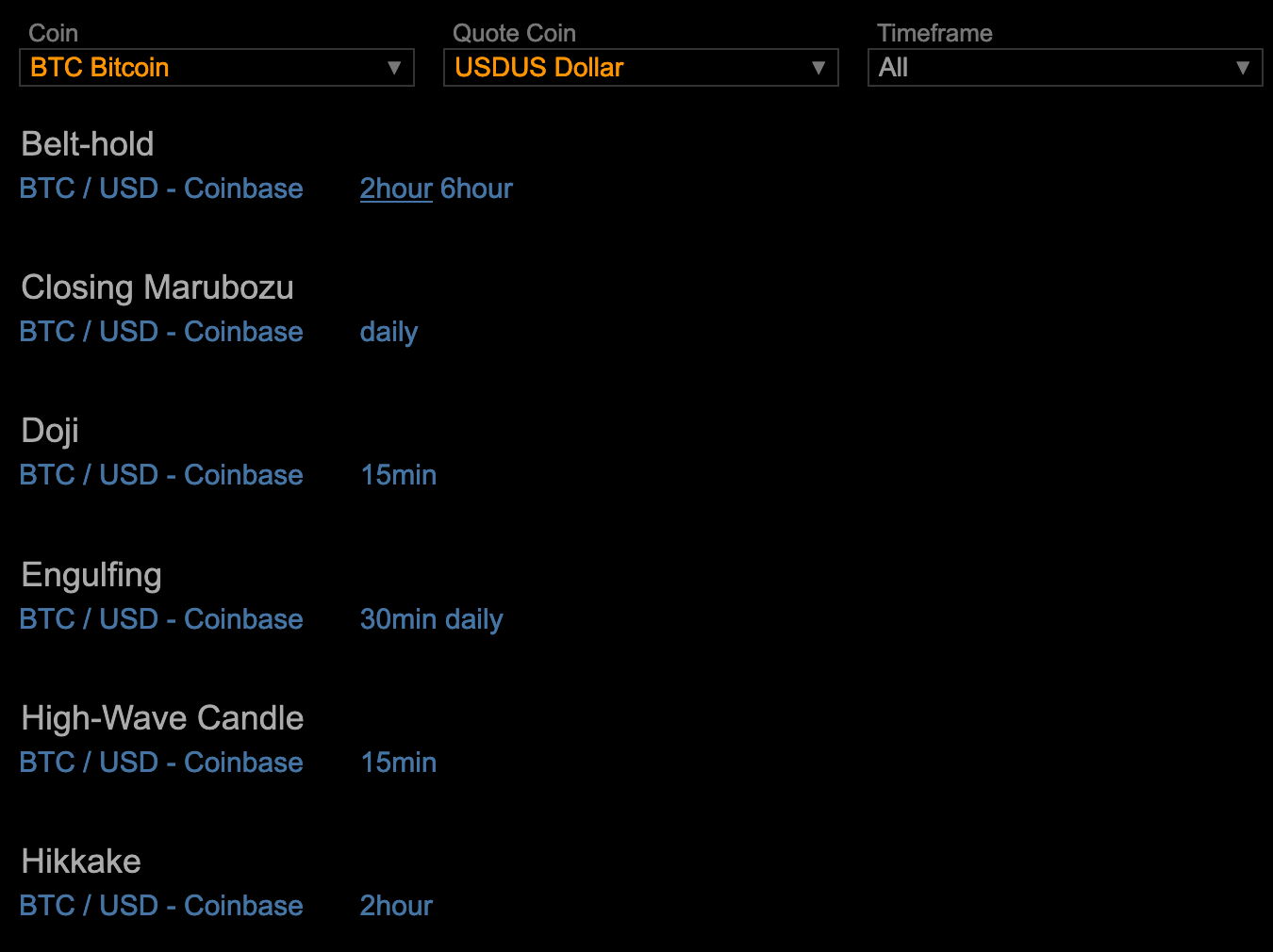
- Coinanalyze tracks all of the candlestick patterns detected on various timeframes for different cryptocurrencies. You can then click on the timeframe of the pattern to visualise it on the chart:
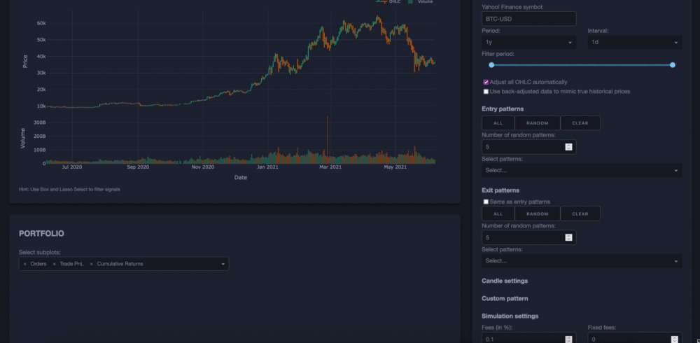
- With vectorbt, you can simulate cryptocurrency trading strategies based on candlestick formations, selecting certain patterns as entry or exit signals. Not only that, but you can also backtest your own customised strategies to show various performance metrics to help you refine your trading plan:
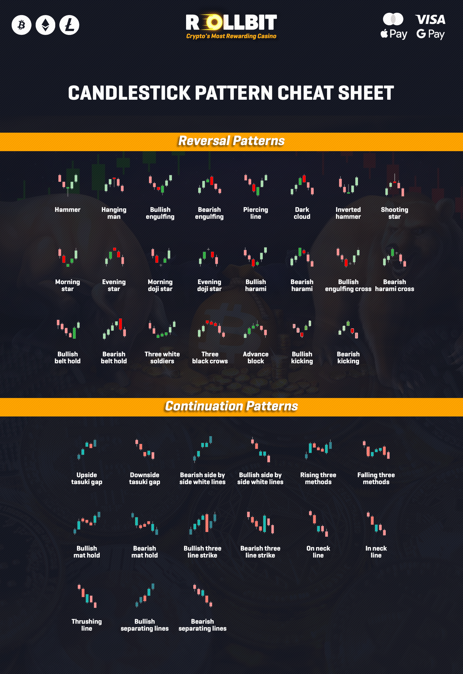
In this article, we've only covered a handful of candlestick formations. You can use our cheat sheet below to identify other patterns:
-The Rollbit Team